Posts

Showing posts from May, 2023

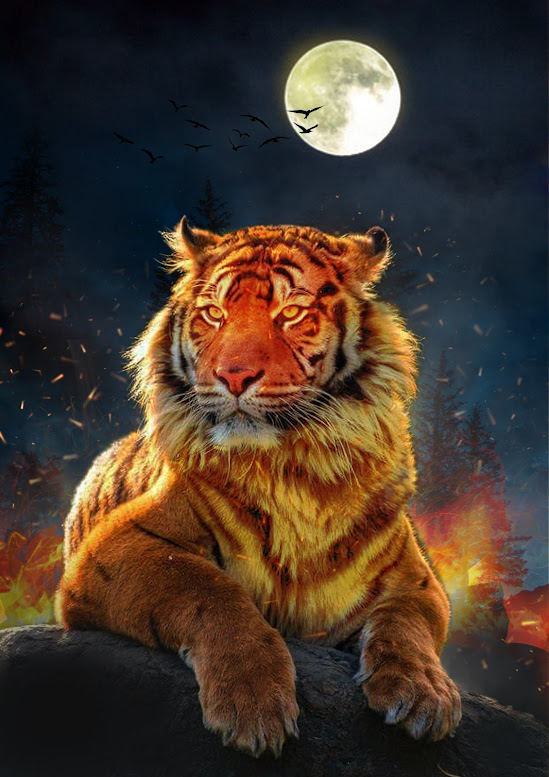
WEEK 8 PROJECT 2: PHOTO IMAGING POSTER DESIGN
Image
Photo Imaging Poster - MyTiger Values Title: Flames for Change Description:   The poster portrays a tiger standing on a boulder in the darkness, with a forest engulfed in flames and thick smoke behind it. Forest wildfires are fueled by climate change, human activities, and natural causes. These fires result in the loss of habitat for countless plant and animal species, disrupt the delicate balance of biodiversity, and release large amounts of carbon dioxide into the atmosphere, contributing to climate change (SDG 13). In line with SDG 15, it is crucial to address the issue of forest fires and promote actions such as halting deforestation, restoring degraded forests, and increasing afforestation and reforestation efforts. Sustainable practices can protect biodiversity, mitigate climate change, and ensure the long-term well-being of ecosystems and communities. Final Outcome _________________________________________________________________________________________________ My Progression St

WEEK 7 PRACTICAL - POSTER DESIGN & PHOTO IMAGING

Image
  EXERCISE 1   DOUBLE EXPOSURE PRACTICE  EXERCISE 2  MY OWN VERSION DOUBLE EXPOSURE

WEEK 6 PRACTICAL - DIGITAL IMAGING EXERCISE 02

Image
EXERCISE 1   PART 01:  RECOLORING (The Breakdown) EXERCISE 2 PART 02: The Breakdown Select one B&W photo - Lisa

WEEK 5 PRACTICAL - PROJECT 2A: EXERCISE 1 (PHOTO MANIPULATION)

Image
Week 5 Practical - Project 2A: Exercise 1 (Photo Manipulation)  Portfolio: Digital Imaging Exercise 01                                                                                                                         Part 1: Shazam This week, I complete Practical 5 as instructed by the tutorial video. Using the quick selection tool, layer mask, filters, and colour correction to finish the tasks. Firstly, I use the quick selection tool to subtract background. To crop out Shazam with more nuanced, I use the Command + ‘+/-‘to zoom in and zoom out while also adjusting the brush size to make it more consistent. After that, add a layer mask and apply it to subtract the background.  Moreover, I copy & paste the Shazam layer to heart mansion and use Command + T (to maintain the aspect ratio, hold the shift button) to resize and reposition it with the background.  Next, I adjust the colour correction by using the colour adjustments while adding some blur filter to Shazam to make it lo

WEEK 4 PRACTICAL - ADJUSTMENT LAYERS & FILTERS

Image
Week 4 Practical - Adjustment Layers & Filters Reflection: This week, I learned how to modify layers and filters to produce a more unified and aesthetically pleasing final result. Before performing any modifications, the layer must first be merged, converted to a smart object, and given a clipping mask in order to prevent an adjustment mess on the image. Following that, I made an effort to tweak each component, including hue, saturation, colour balance, brightness, etc. In order to achieve a balance with the tone of the element, I also changed the background's colour. Overall, the steps improve the overall aesthetics of the picture. Below are the before and after of my work: BEFORE AFTER